social media posts for a variety of clients
The collections below show how content is tailored to each partner’s voice, audience, and goals, blending clear messaging with compelling visuals to drive engagement across their platforms.

Teaching and amplifying others are at the heart of Brené Brown’s social content. The select visuals, together with her thoughtful captions, reflect that focus.
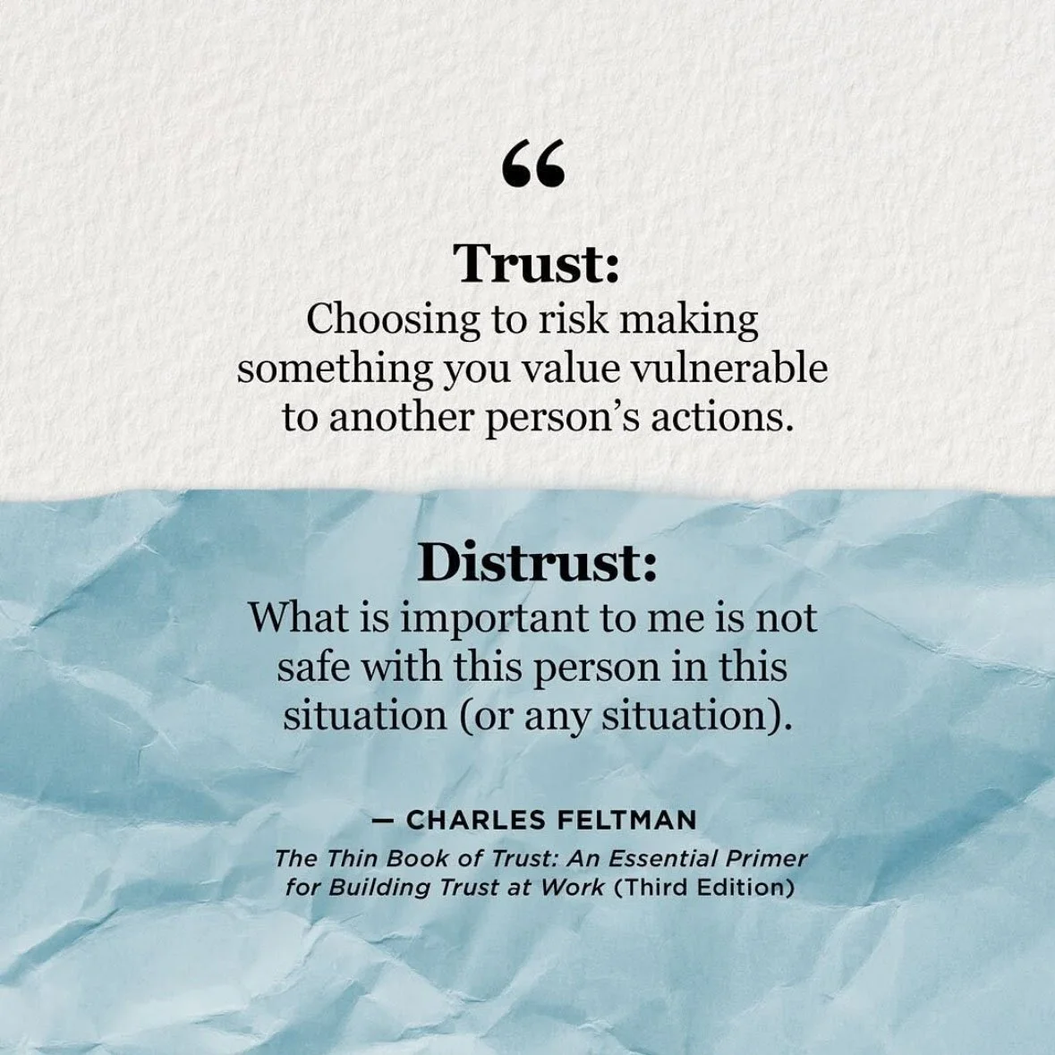
Utilizing the contrast between a smooth sheet of paper and a crumpled one to create a visual metaphor in this teaching graphic with insight from Charles Feltman’s popular book.
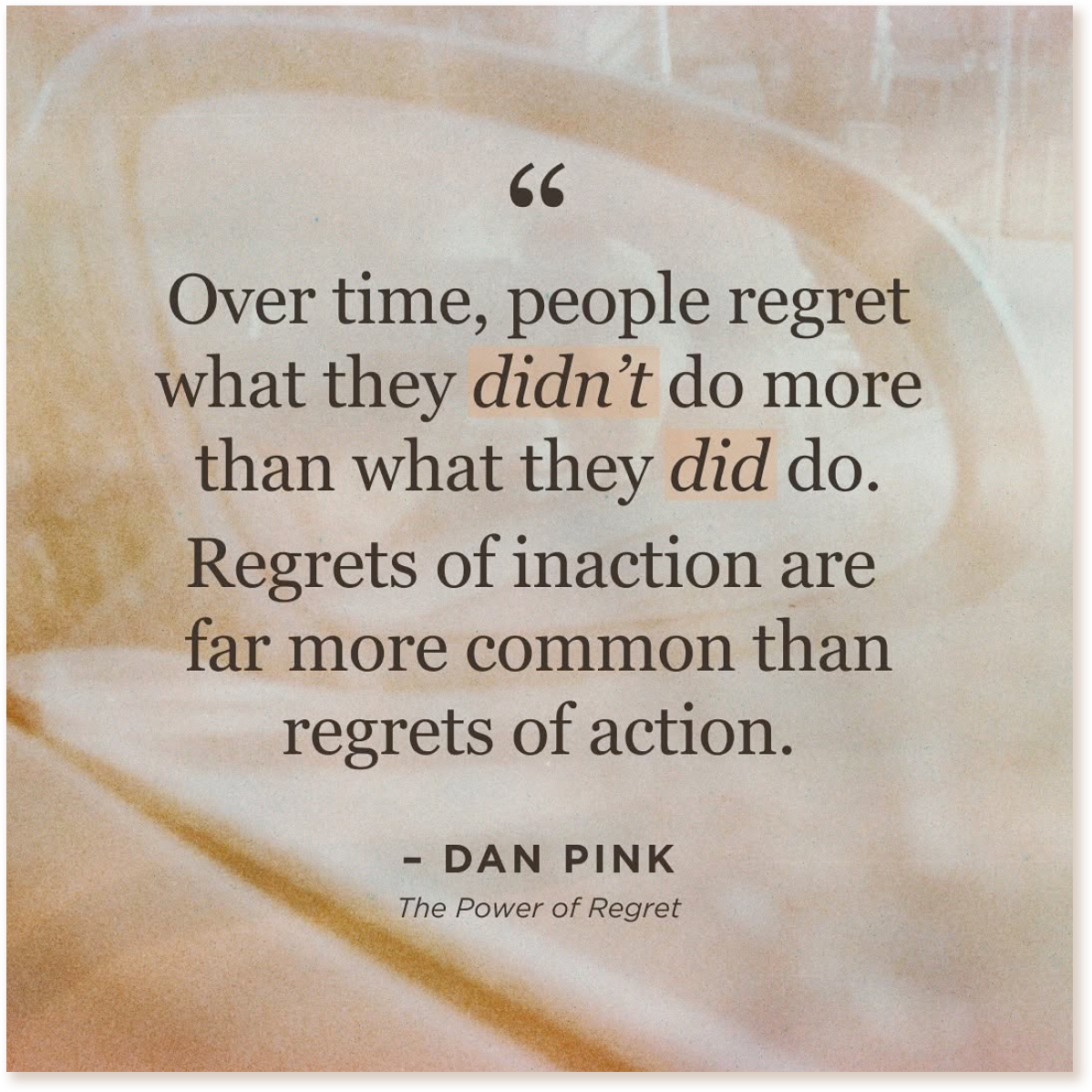
This powerful quote by Dan Pink already stirs emotions tied to regret. To echo regret’s reflecting nature, the quote is framed by a faded polaroid of a rear-view mirror.
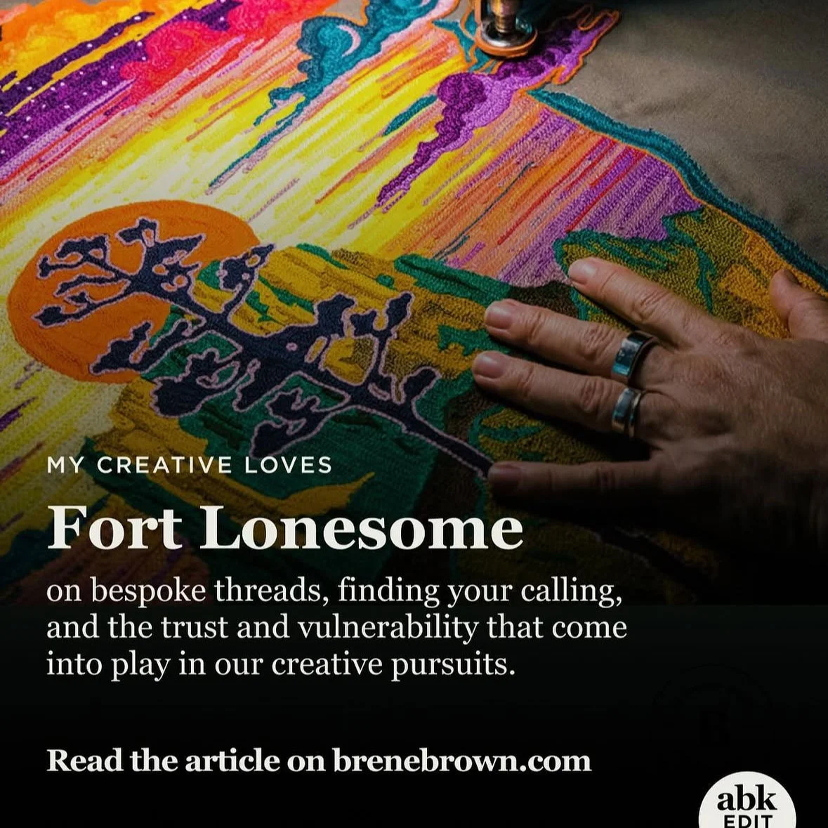
Striking photography, clear article details, and a subtle brand mark in the corner for the editorial section of Brené’s website, the ABK Edit, work together to reinforce the focus on amplification, Photography by Wynn Myers.
assets courtesy of Brené Brown
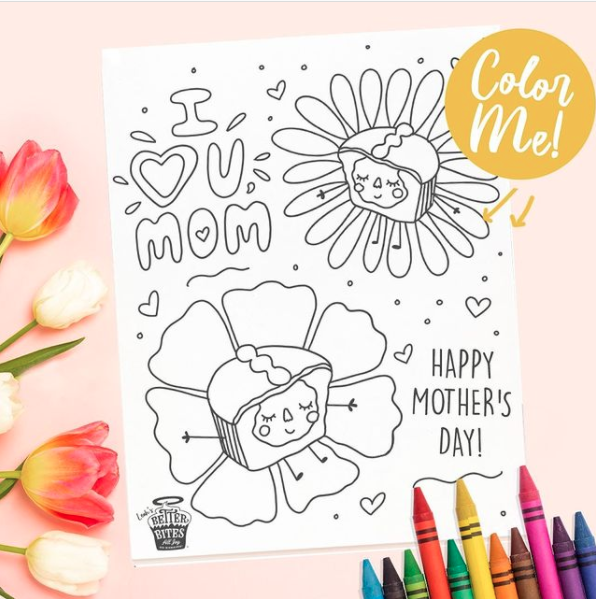
Better Bites Bakery focuses on worry‑free, allergy‑friendly desserts for a largely female audience, those who carry the snack bag, manage the food rules, and still want treats to feel fun. These posts, like their snacks, are designed to spark interaction and sharing.
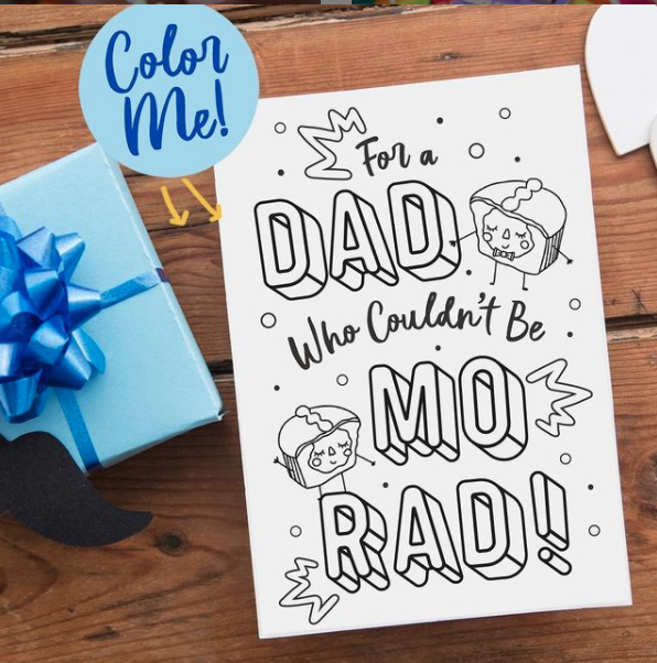

character illustrations by Cristina Romero
Food styling provides the opportunity to treat every ingredient like a design element, spell out key benefits, and make each product feel instantly cravable and share‑worthy.
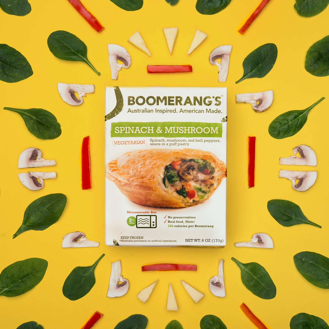
A knolling vibrant pattern highlighting real ingredients to reinforce the freshness and transparency of Boomerang’s Pies.
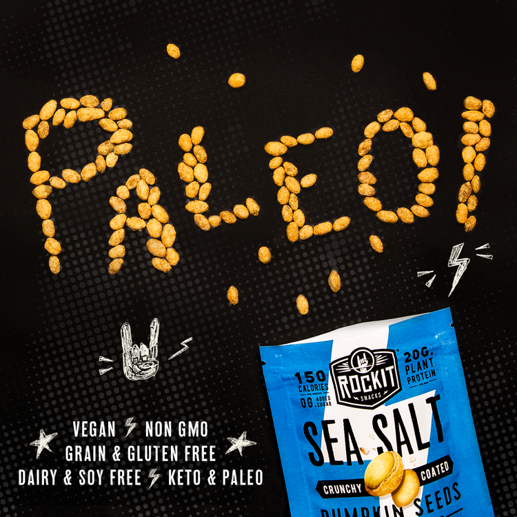
Using RockIt Snacks’ crunchy product to literally spell out a key benefit, turning the claim into a bold, scroll‑stopping visual.
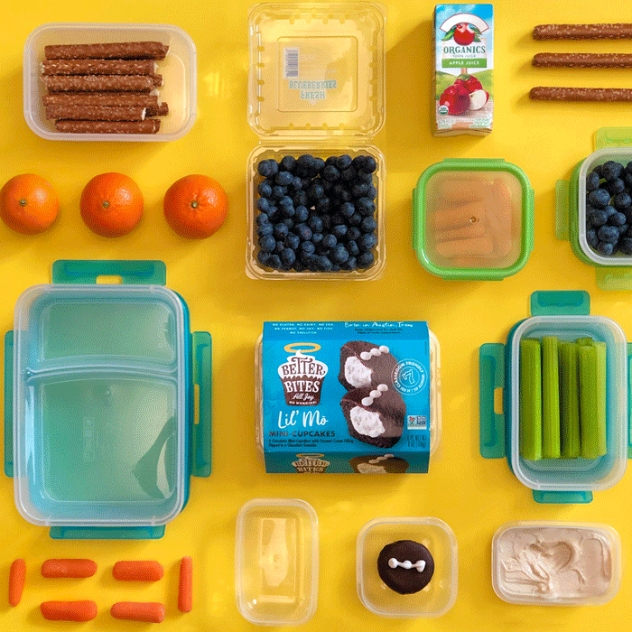
Back‑to‑school lunch prep knolling scene that positions Better Bites as the worry‑free treat parents can toss in the snack bag.
let’s work together
