Making The Brand
the ideation, inspiration, connections, and meanings that went into the design.
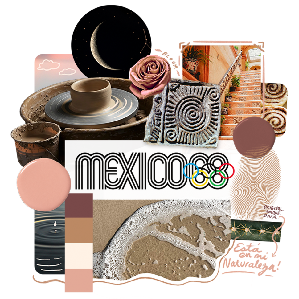
Casa Caneluna’s moodboard
While creating my personal brand I wanted to put as much care and intention into how I represent myself as I do my clients. My design education taught me that every decision should have a reason and thought process. Otherwise, it was gratuitous — communicating nothing and taking away from the core message. This learning became a cornerstone in my design process and one of my favorite parts — making connections between what to include, which design principles to employ, and how to visually communicate the message.
Artists take inspiration from here, there, everywhere, and make it their own, so I injected as many personal reasons and connections into the design as I could.
I wrote this as a window into my brain and to show how together, these ideas resulted in the little swirl cradled by a crescent moon logo you see on this site. Let me show you around.
The Name
Did you know, canela means “cinnamon” in Spanish? That’s my last name, which I love and have always been proud of, so I knew I wanted it to be a big driving force in my studio and its branding.
Plus, as a Cancer zodiac sign I have always felt incredibly connected to the moon as it’s the sign’s ruling planet. Spanish is my first language and I wanted to go back to my roots. Connecting both Canela and the Spanish word for moon, luna, I found “Caneluna.”
As kismet has it, the waning crescent moon shape (which coincidentally is the phase of the moon I was born under) also looks like a C. Nestled within the curve of the moon is the swirl, which unfurls from a lowercase e.
The colors
My last name also informed the color palette for the brand, featuring rich, warm browns. Not only that, the palette nods to skin tones and therefore diversity and representation, which hold a lot of importance for me.
Additionally, we know the moon draws the ocean’s tides, which is where I feel most at home. The peaceful predictability of the rhythm of crashing waves, the foam it forms, and the warm sand beneath me were further inspiration for the palette.
The Inspiration
Going into ideating I knew I wanted to pay homage to what is, in my opinion, the best design system ever created: the 1968 Mexico Olympics. Lance Wyman and his team really knocked it out of the park and when I saw it, it just felt RIGHT!
Being Mexican, I accept that there might be some bias on my part but the pull the iconography, color choices, and most strikingly, the bold black concentric outlines had on me were undeniable.
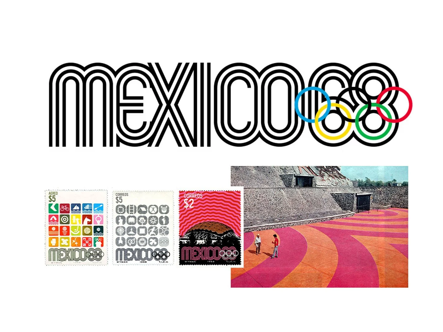
Image Credit: Lance Wyman
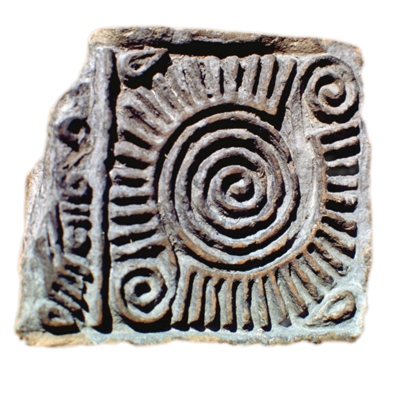
Image Credit Lance Wyman
I set out to evoke the graphic nature of the concentric outlines and the visual research began. I came across a Mexican stamp artifact that Wyman used as inspiration and from there the rest unraveled quite quickly and serendipitously.
The Little Swirl That Says So Much
Cinnamon.
The cinnamon theme continues here with a nod to the way a cinnamon roll looks on your plate and the way a cinnamon stick curls.
Ripple.
The concentric circles are reminiscent of the ripple a single drop can make. It’s a recognizable visual of how energy moves outward from a center, transforming everything around it and is a metaphor for how one small action or element affects a larger whole.
Blooming Rose.
I referenced a rose for the process in which it blooms and unfurls. The rose serves as a constant reminder for me that growth can’t be rushed and what is within us comes forward when it is ready.
Fingerprint.
Fingerprints feature spiral ridges unique to each individual on the planet, much like DNA. Whenever I add this mark, it’s my signature and you know it came from my imagination, heart, and hands. Plus, as the great poet Kendrick Lamar once said, “I got hustle, though, ambition flow inside my DNA.”
Ceramics Wheel.
Potters use the wheel as a tool to create forms from a mound of clay. It moves counter-clockwise at different speeds, controlled by the artist through a foot pedal and the swirl captures this motion. Additionally, the head of the wheel is usually a metal circle with concentric ridges marked.
I founded Casa Caneluna as the metaphorical home for my original artwork (in any and every form) that I create. During the design process I added recognizable symbols of a house like doors, tile, and wall textures to further connect the name to the idea that
you’re always welcome here.
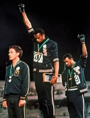
An important note
While not design related, it is important for me to share the Mexico 1986 Olympics event is also known for the iconic photo of Black athletes Tommie Smith and John Carlos raising their fists on the podium after their wins for a gold and bronze medal respectively. The Olympians described their choice as a tribute to their African American heritage and a protest of the US’ treatment of Black citizens. White supremacy is still a rampant system of oppression and I applaud their courage.
Image via AP—REX/Shutterstock.com / Britannica